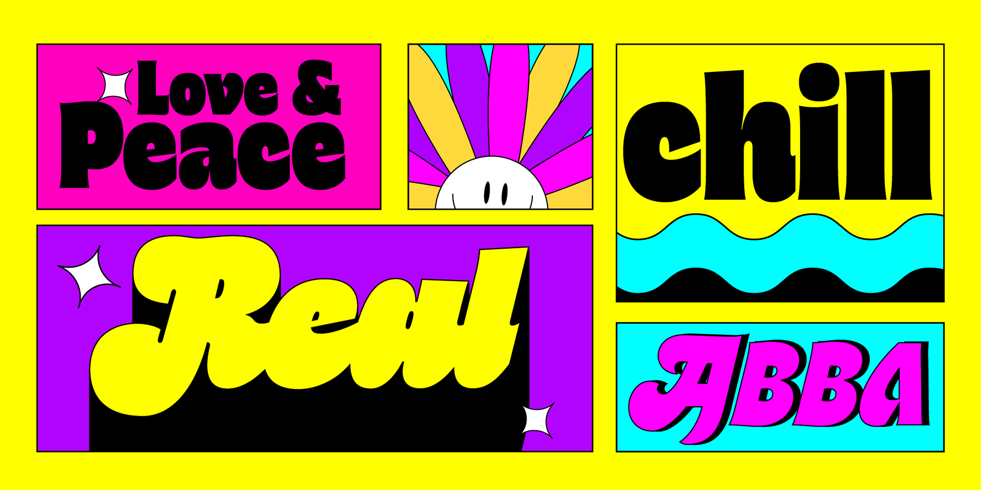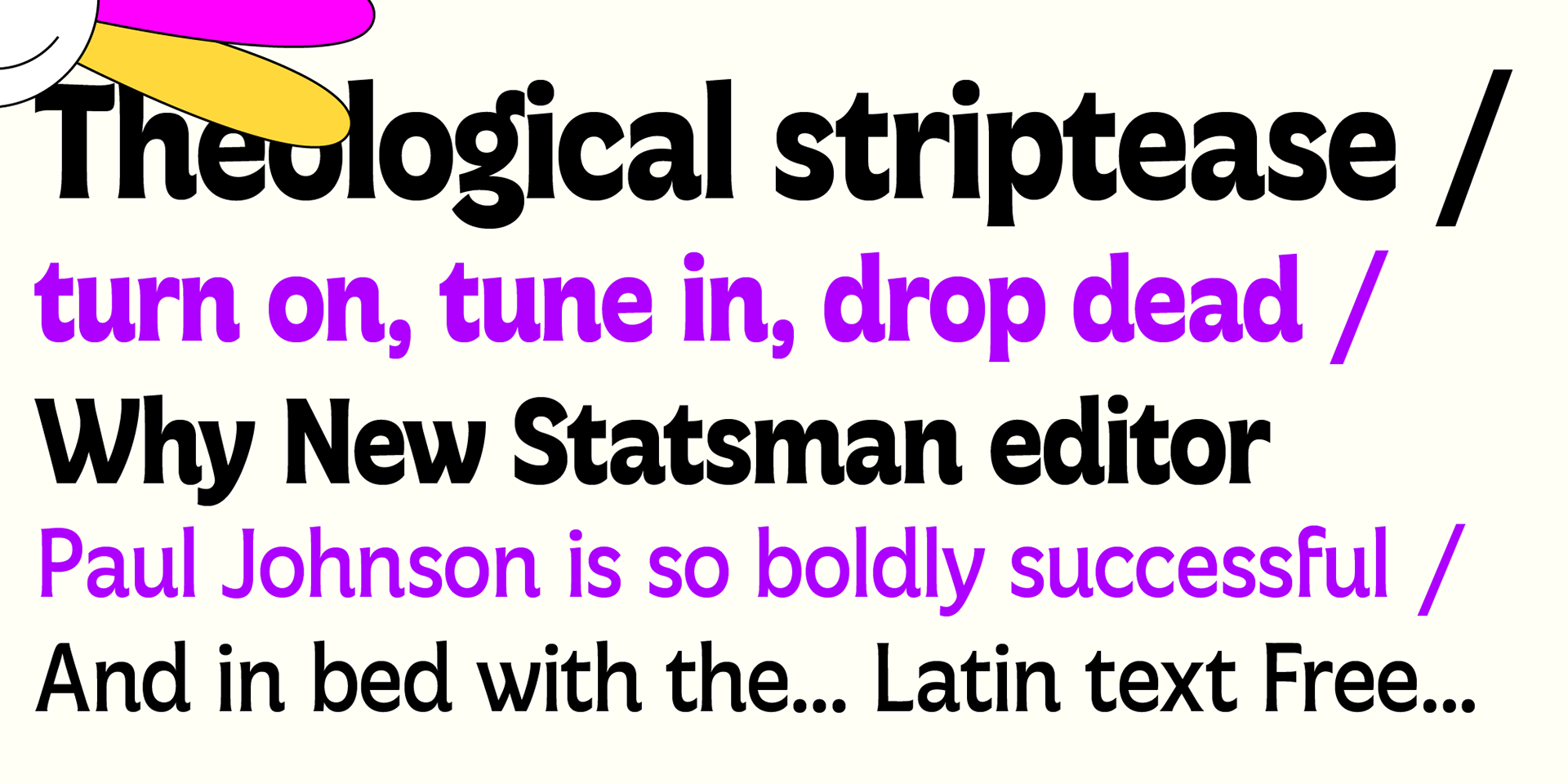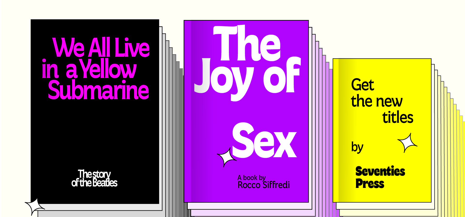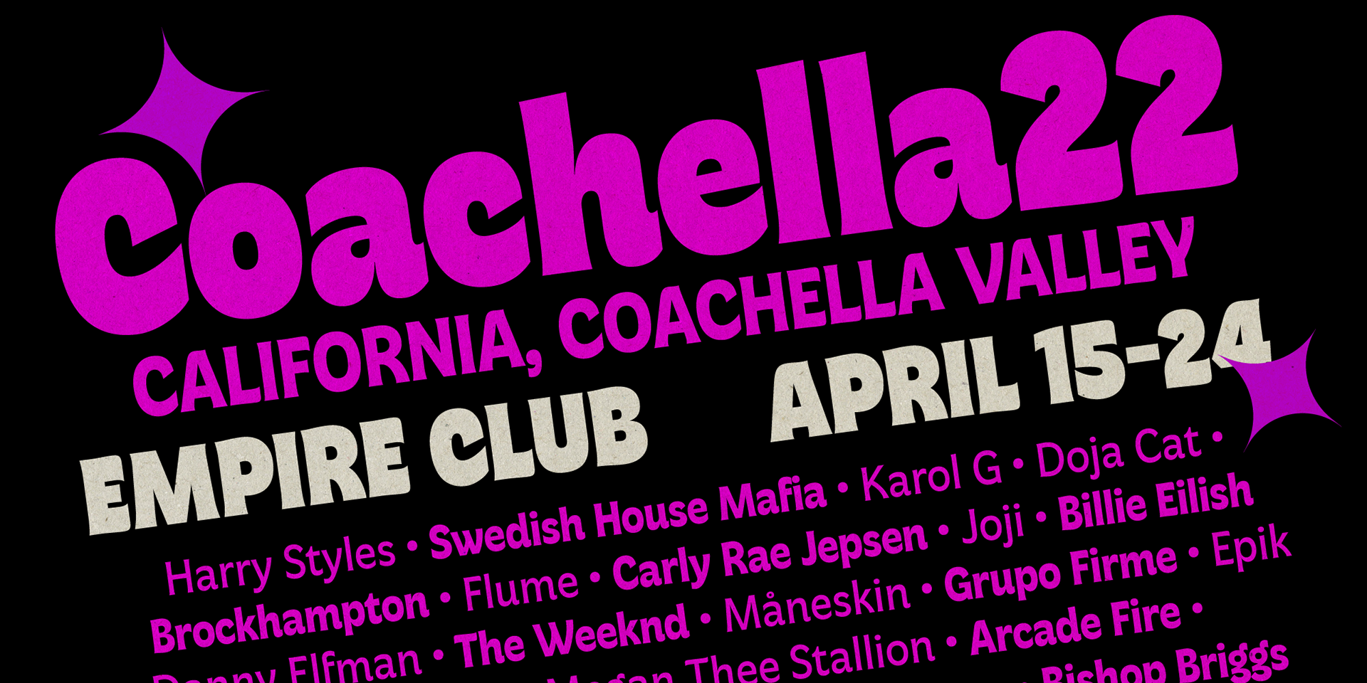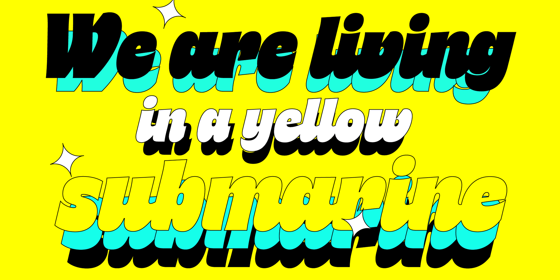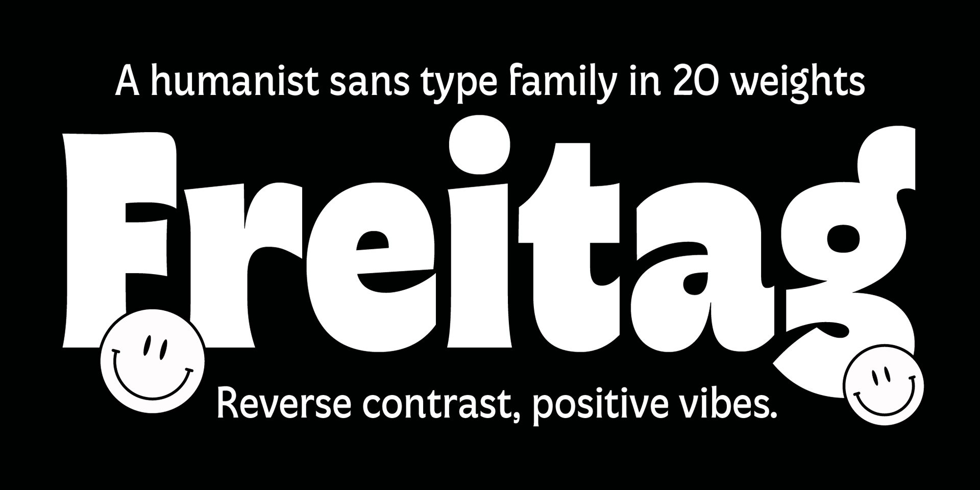
Which would be the sound of an imaginary typographic Woodstock, with Novarese, Motter and Benguiat playing onstage with Jimi Hendrix? According to Cosimo Lorenzo Pancini, that would be the sound of his new font, Freitag (Friday in German) - a tribute to the buoyant, vivacious typography of the seventies and the vibrant energy of the first post-modern, psychedelic age.
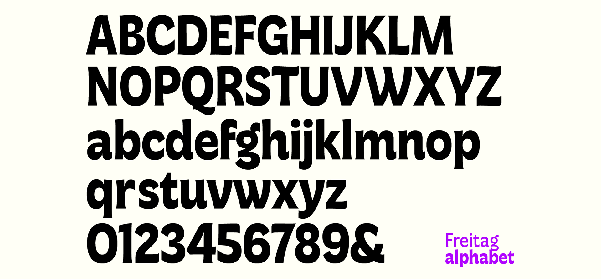
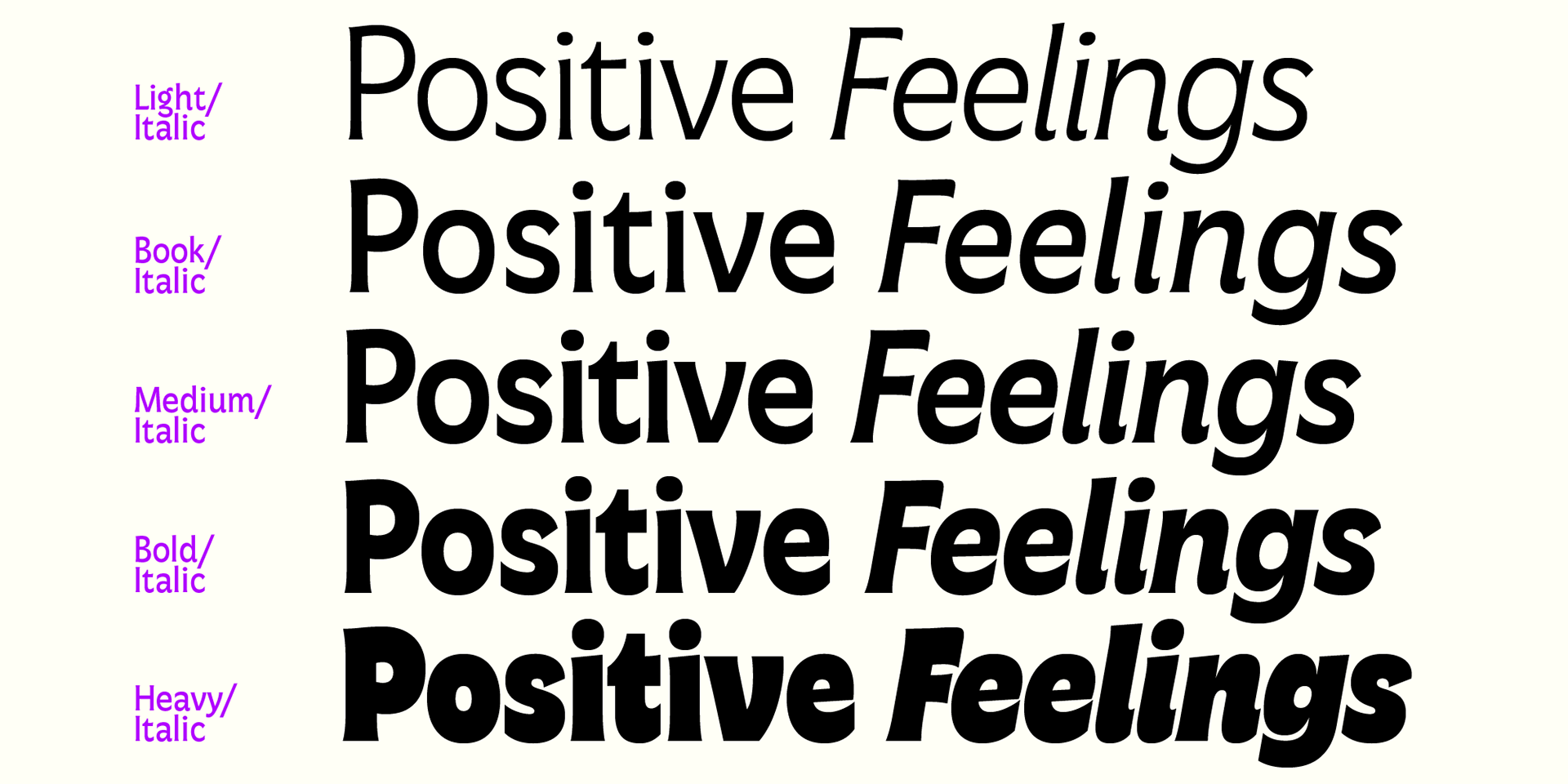
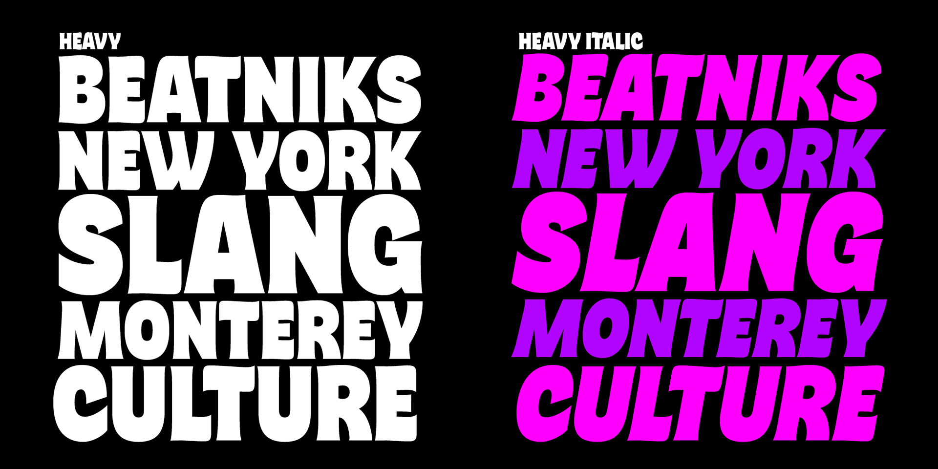
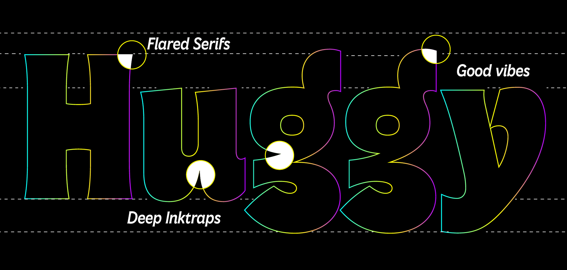
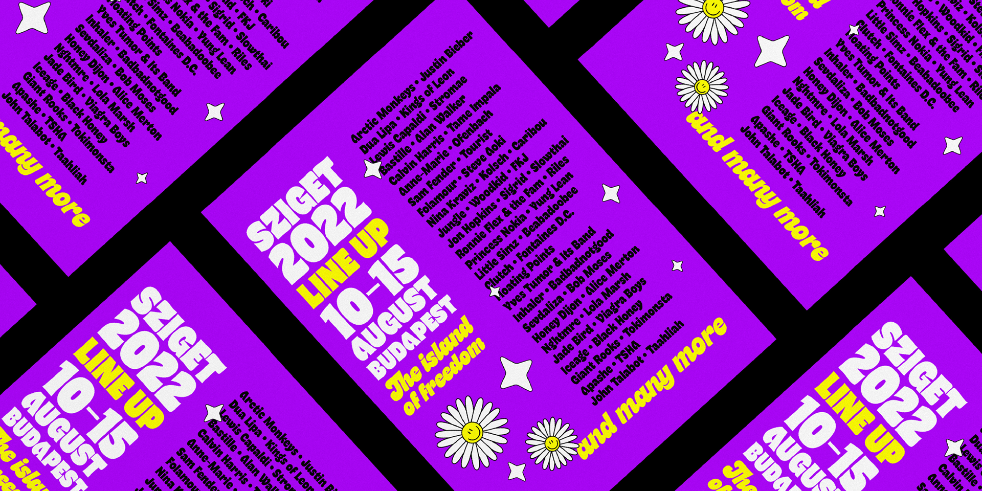
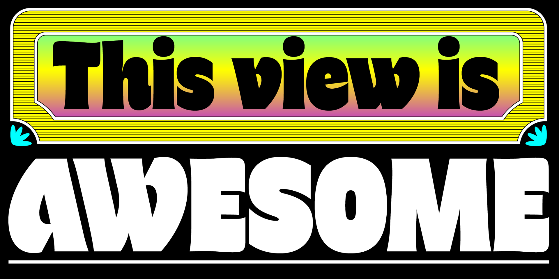
The starting point of Freitag was the design of an extrabold sans serif with humanist condensed proportions, flared stems and reverse contrast, that generated both the main family, and a variant display subfamily. A bit like our desire for the weekend increases during the week, Freitag slowly builds the tension and design exuberance while weight increases. In Light and Medium weights the font shows a more controlled, medium-contrast look, perfect for display, titling and editorial use.
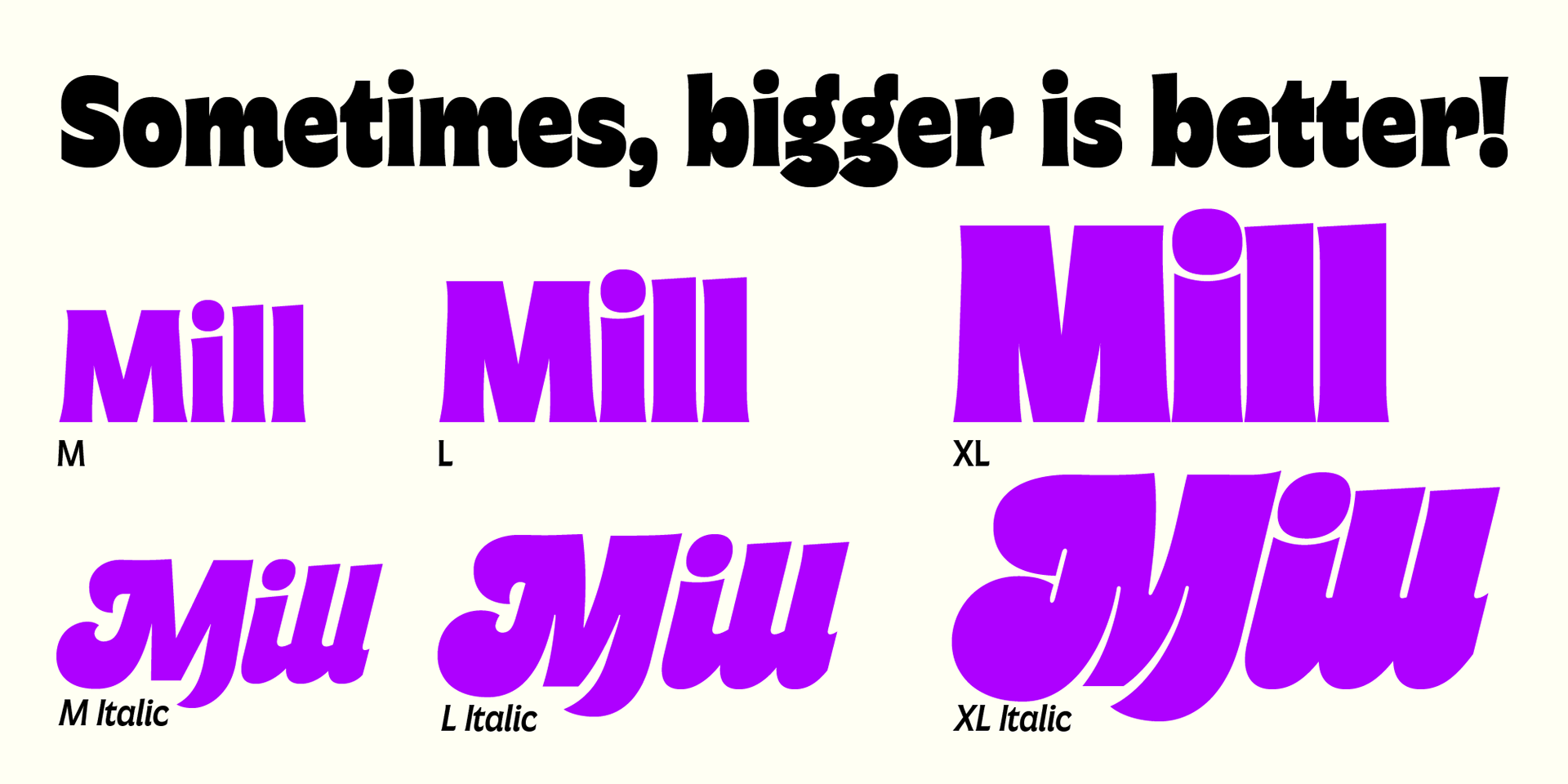
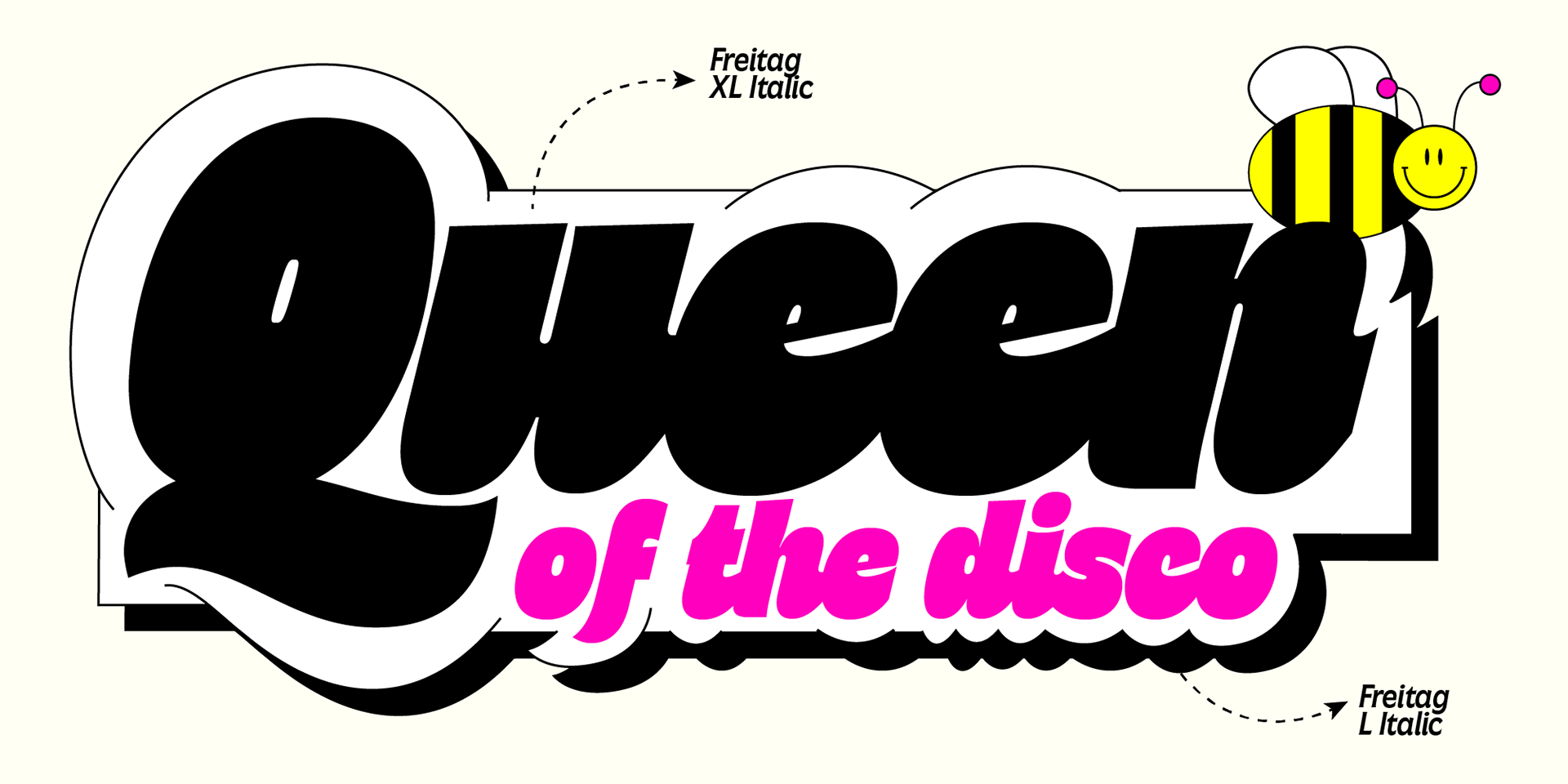
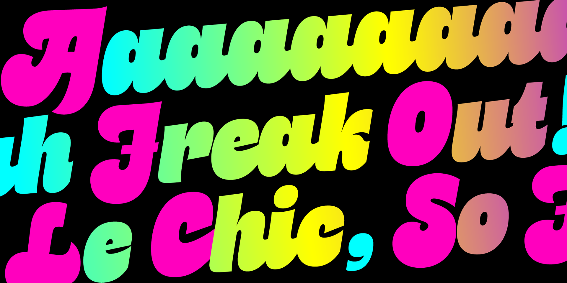
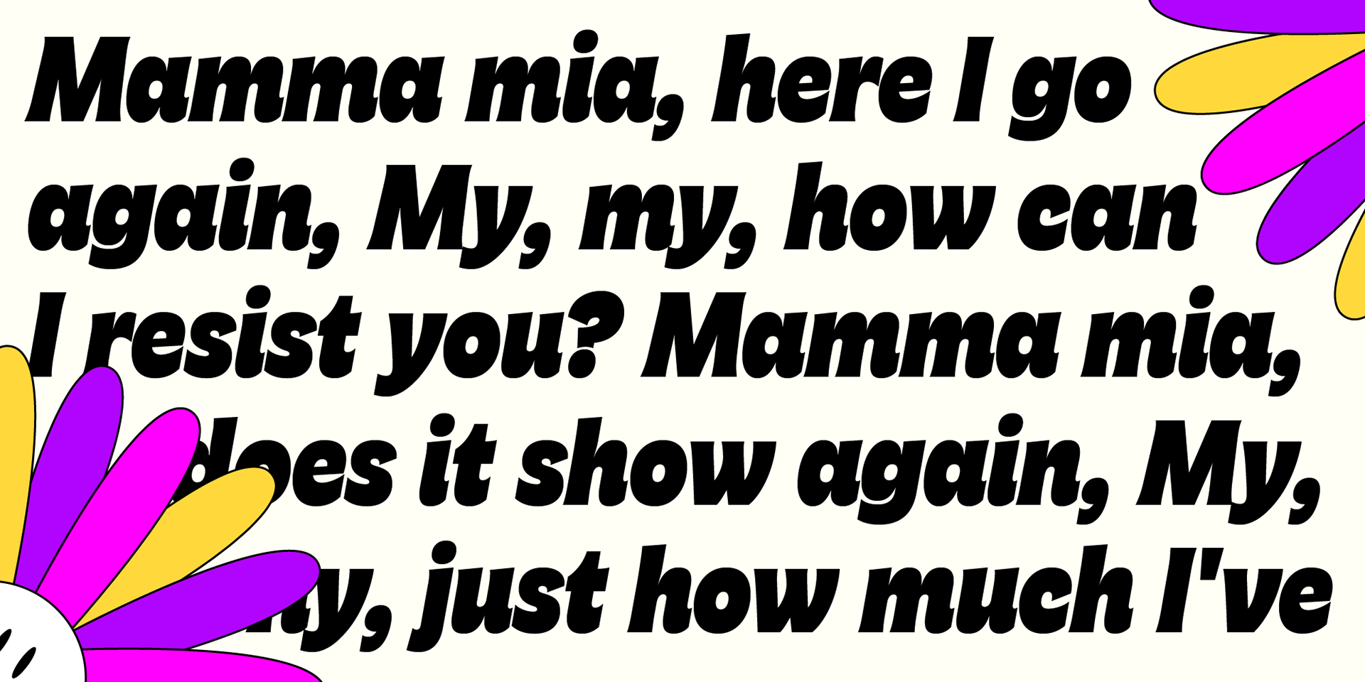
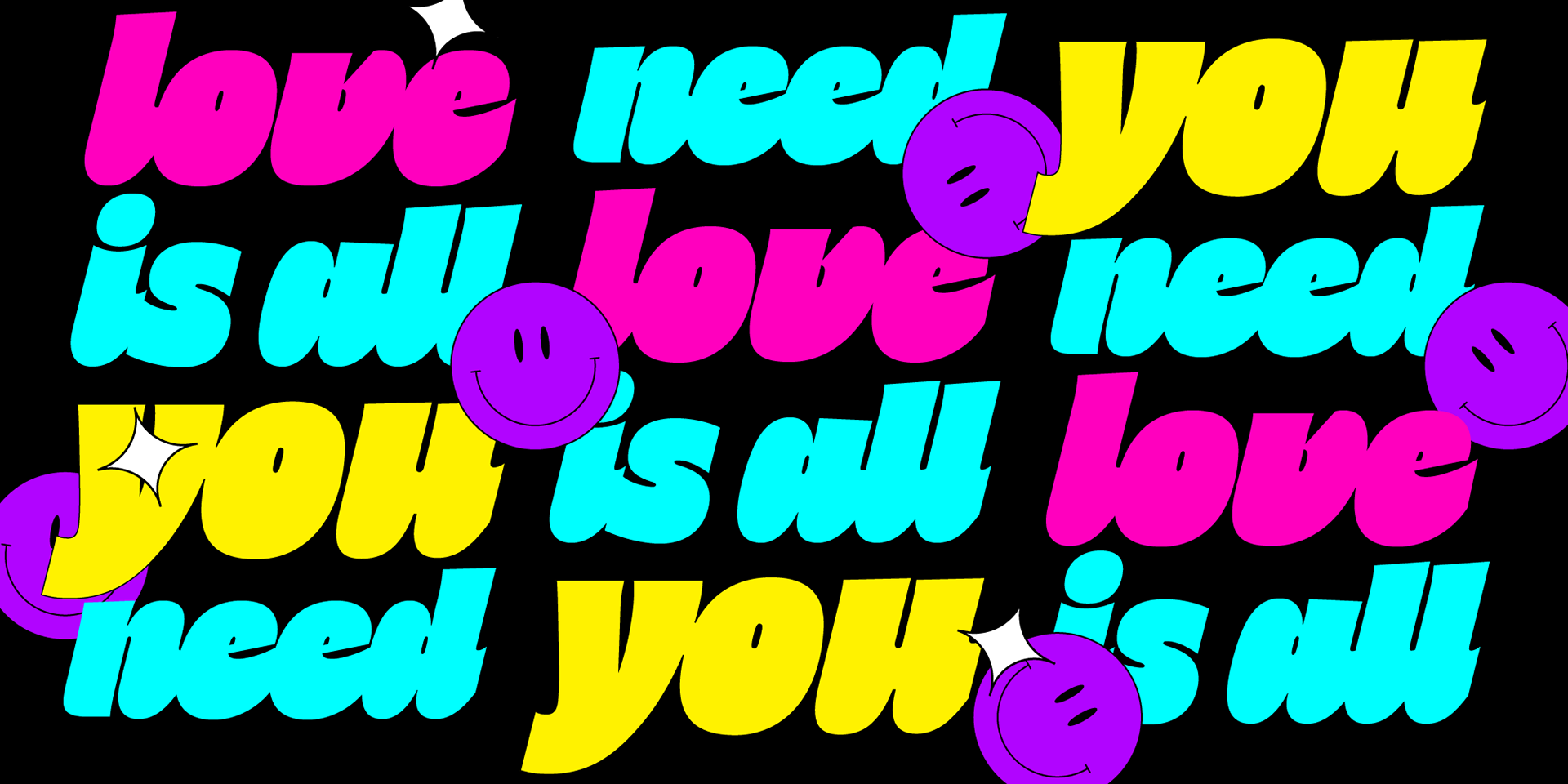
Need body text? Use the Book weight, with a more relaxed letter spacing allowing usage in smaller sizes and short body copy. As weight increases in the Bold weight the style becomes more expressive, with a visible reverse contrast building up and culminating in the Heavy weight with his clearly visible "bell bottoms" feel. In the Freitag Display sub-family the design is pushed further by introducing variant letterforms that have a stronger connection to calligraphy and lettering. Also, the weight range becomes a optical one, with weights marked as Medium, Large, XLarge - bringing the contrast and the boldness to the extreme creates smaller counterspaces that require bigger usage sizes. Another important addition of the display subfmaily is the connected italics that sport swash capitals and cursive letterforms, developed with logo design and ultra-expressive editorial design in mind. The resulting complete Freitag family is developed in 16 weights + 4 variable fonts, allowing full control of the design over its bell-bottoms, flower power, tree-hugging design space.
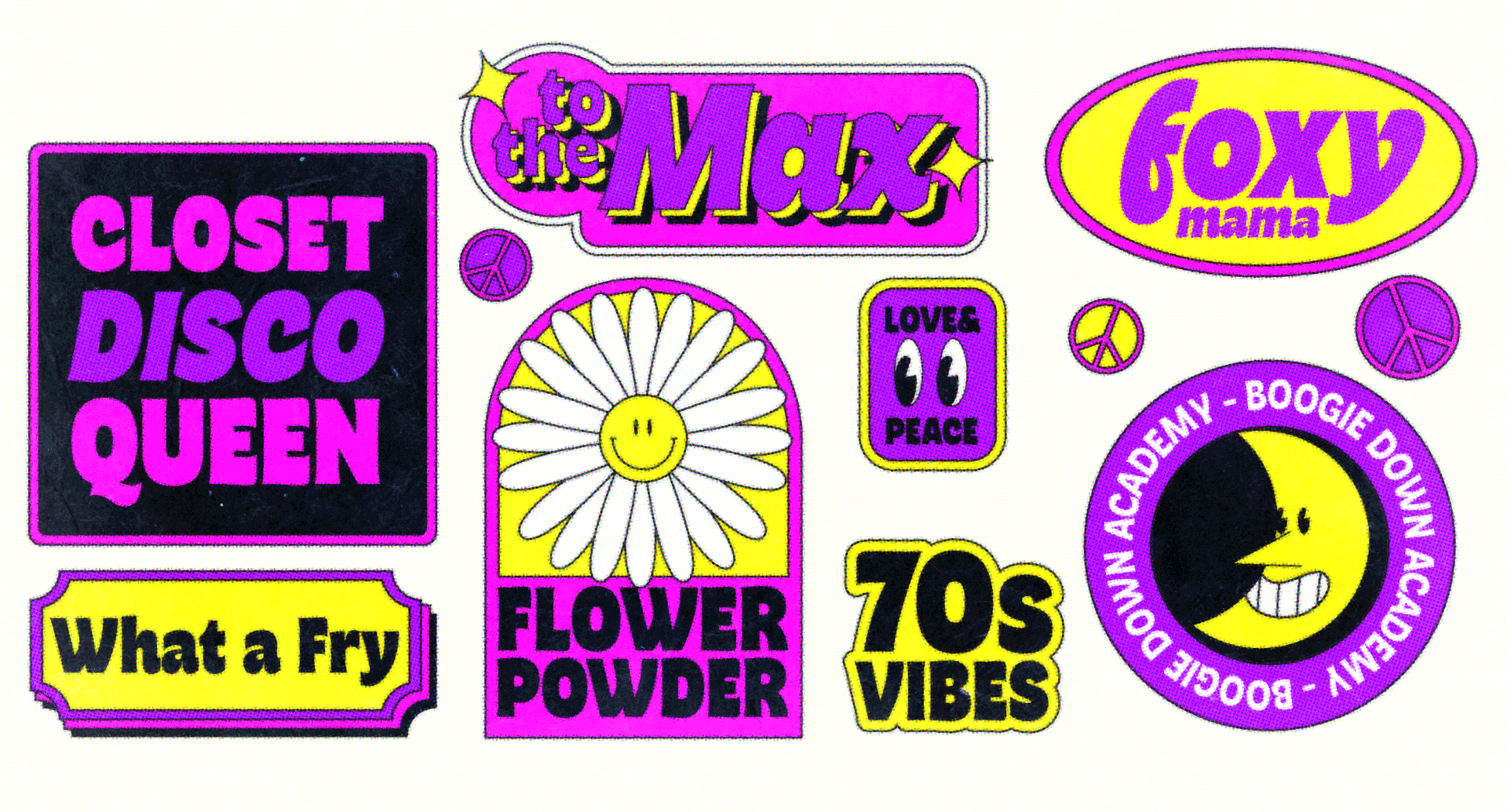
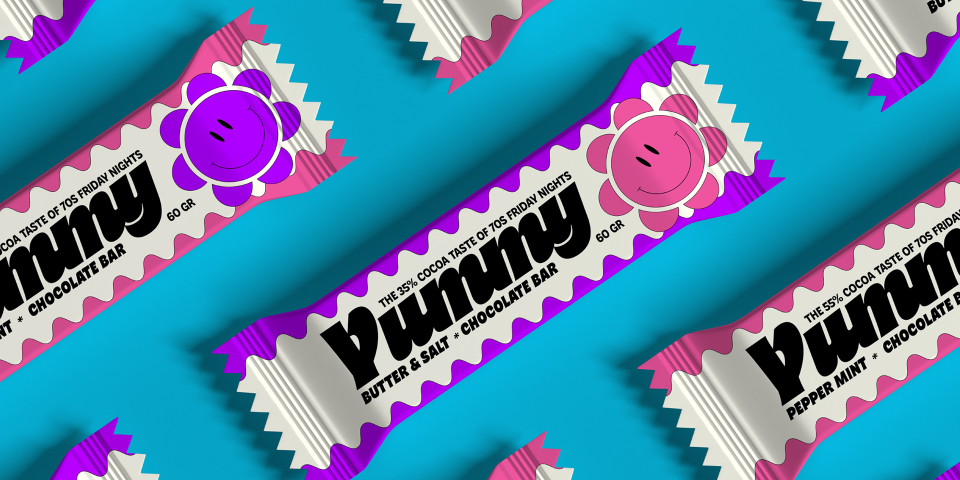
Get ready to be inspired by our tribute to the times when the lush shapes of Art Nouveau reinvented by Psychedelia invaded pop culture, and rub transfer technology inspired designers everywhere to enjoy bubbly letterforms in a joyful meltdown of geometric excess and calligraphic rigour. Jeepers creepers!
Gott sei Dank ist es Freitag ...Thank God it's Friday!
Discover the font and download the trial version
for free on https://www.zetafonts.com/freitag
for free on https://www.zetafonts.com/freitag